Of all the decisions that go into designing a home, choosing paint colours creates the most anxiety — and produces the most complaints six months later. Colour psychology in interior design for Indian homes is genuinely complex: our light is different, our cultural associations with colour run deep, and the interplay between a chosen hue and an actual wall under Delhi's blazing afternoon sun can be completely different from how it looked on a paint chip in the store. Understanding the principles behind colour psychology will not eliminate the difficulty, but it will replace guesswork with a framework that produces consistently satisfying results.
This guide walks through how colour affects mood and perception, which colours work best in each room, how India's climate and light conditions modify those recommendations, and how to test and finalise your palette before committing to a full repaint. The principles apply whether you are furnishing a new flat in Gurugram, renovating a bungalow in Noida, or refreshing a single room in South Delhi without touching anything else.
Why Colour Psychology in Interior Design Matters More in India
Colour is not merely decorative — it is physiological. Different wavelengths of light trigger measurably different responses in the human nervous system. Warm colours (reds, oranges, deep yellows) stimulate the sympathetic nervous system: heart rate rises slightly, alertness increases, and time feels like it passes faster. Cool colours (blues, greens, soft purples) do the opposite: they activate the parasympathetic system, lowering perceived stress and slowing the perception of time. This is not a matter of personal preference — it is a biological response that holds across cultures, with some variation in the intensity and specific associations.
In the Indian context, two factors make colour psychology in interior design especially important. First, our homes tend to be smaller relative to family size — a well-chosen colour palette can make a 2BHK in Dwarka feel open and airy, or it can make a spacious flat in Vasant Kunj feel claustrophobic despite its square footage. Second, India has a rich and specific cultural vocabulary around colour — saffron, sindoor red, peacock blue, turmeric yellow — that carries emotional weight beyond what those colours mean elsewhere. A colour that reads as neutral or clinical in a Scandinavian context may feel charged or festive in an Indian one. Good colour psychology in Indian interiors means working with these associations thoughtfully rather than ignoring them.
Choosing a paint colour is not about what you like in isolation. It is about how that colour will behave on your specific walls, in your specific light, with your specific furniture — every day for the next seven years.
The Colour Temperature Framework: Warm, Cool, and Neutral
Before diving into room-specific recommendations, it helps to understand the three broad families that organise most interior colour decisions.
Warm Colours
Warm colours — reds, oranges, rich yellows, terracottas, and rusty browns — advance visually, meaning they make surfaces feel closer than they are. This makes them excellent for large, underfurnished spaces that need to feel more intimate, and less ideal for small rooms that already feel tight. Warm colours feel welcoming and convivial, which is why they have long been used in dining spaces and communal areas. In Indian homes, warm earthy tones — burnt sienna, mango ochre, spiced terracotta — sit naturally in the context of our climate, craft traditions, and natural materials. They also flatter the warm-toned natural light of Indian evenings.
Cool Colours
Cool colours — blues, greens, blue-greens (teals), soft lavenders, and cooler greys — recede visually, making surfaces feel farther away. They are the primary tool for making compact Indian apartments feel more spacious. Cool colours also carry strong psychological associations with calm, focus, and refreshment — deeply welcome in a country where summer temperatures regularly cross 40°C. The right shade of sage green or slate blue in a bedroom can transform the room's emotional temperature as effectively as an air conditioner transforms its physical one.
Neutral Colours
Neutrals — whites, off-whites, warm beiges, greiges (grey-beige hybrids), and deep charcoals — are the backbone of contemporary Indian interiors. They provide a visual rest between stronger elements and let furniture, textiles, and artwork carry the colour story. The trap with neutrals is assuming they are all the same. Every neutral has an undertone — warm (pink, yellow, peach), cool (blue, green, grey), or truly neutral — and that undertone becomes dramatically visible on a large painted wall. More on this in the testing section.
Room-by-Room Colour Recommendations for Indian Homes
Living Room
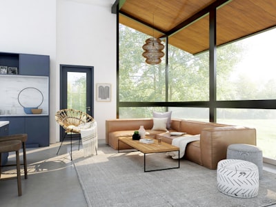
The living room carries the most colour decisions because it is typically the largest and most public space. A useful approach is to anchor the room with a single dominant neutral on three walls, then introduce personality through one statement wall or through soft furnishings. Deep terracotta, dusty blush, muted olive, and slate blue all make excellent living room accent colours in Indian homes — they feel contemporary without erasing a sense of cultural rootedness.
If you have a smaller living room, keep all four walls light and bring colour in through the sofa, cushions, and rugs rather than the walls. For small living rooms in Delhi NCR apartments, a ceiling painted slightly lighter than the walls creates the illusion of height — a simple trick that costs nothing extra.
Bedroom
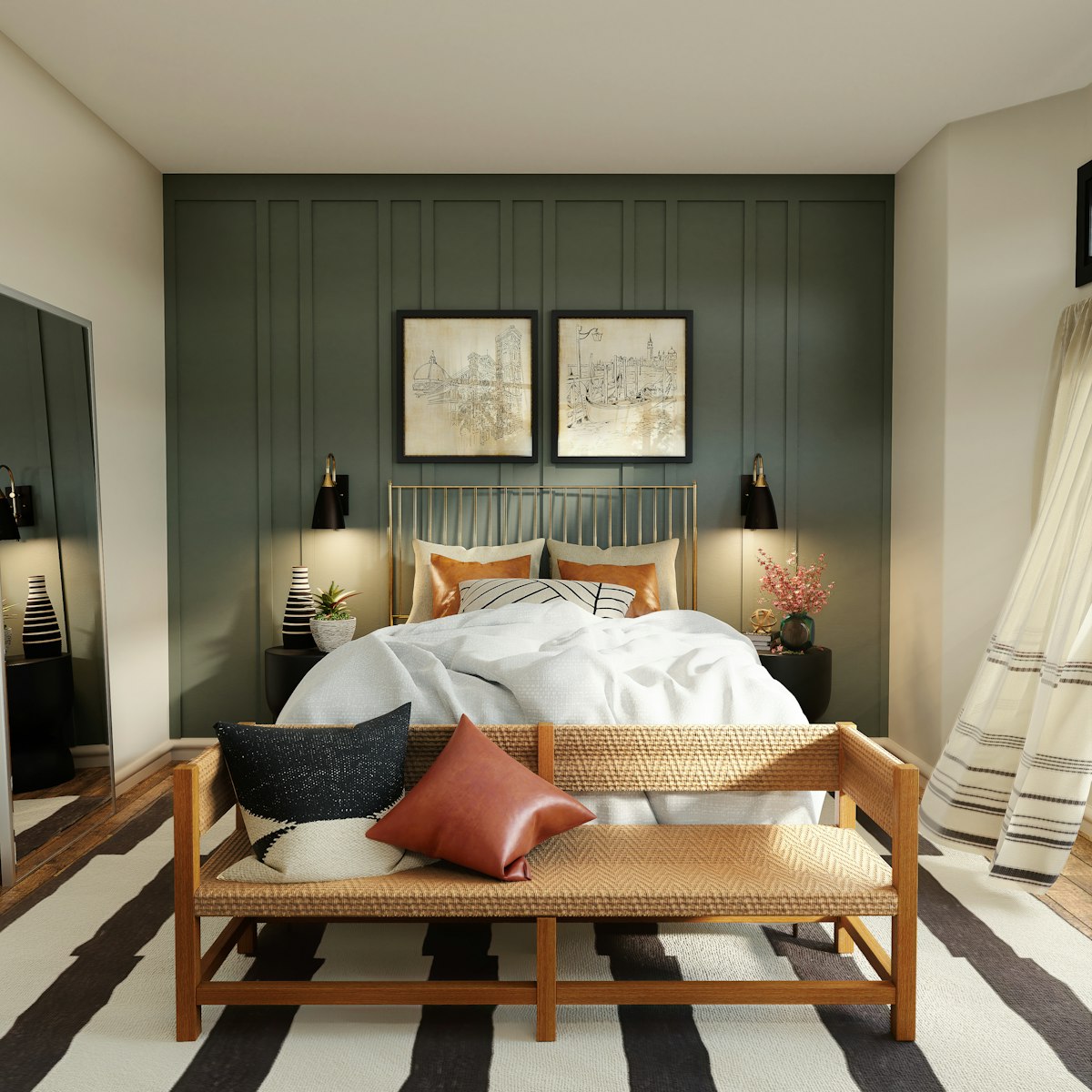
The bedroom needs to support sleep, and colour psychology in interior design is unambiguous here: cooler, softer tones outperform bright or warm ones for restfulness. Muted sage green, dusty blue, soft lilac, warm greige, and deep but desaturated navy all create the psychological conditions for rest. Avoid saturated, bright colours — particularly reds, bright oranges, and stark white — in bedrooms. Stark white, despite feeling clean and neutral, can create a visual stimulation that makes it harder to wind down. A warm off-white (with a beige or pink undertone) is almost always a better bedroom choice than a cool, bluish pure white.
Kitchen
Kitchens benefit from colours that feel fresh, clean, and appetite-stimulating without being so stimulating that they create stress during long cooking sessions. Crisp whites, warm creams, soft yellows, and sage greens all perform well. Deep navy or forest green on kitchen cabinets against white walls has become a popular choice in updated Delhi NCR kitchens — it feels sophisticated without making the space feel heavy. Avoid deep, dark colours on all surfaces in a kitchen with limited natural light; the room will feel oppressive rather than dramatic.
Bathroom
Bathrooms in Indian apartments are typically small, so the primary colour goal is spaciousness. Pale, cool tones on walls combined with white fixtures is the classic approach for good reason. However, a single accent — a deep navy or emerald green on one wall behind the vanity, or a richly coloured tile as a feature — transforms an otherwise plain bathroom without sacrificing the sense of space. Keep the floor and ceiling light to maintain the sense of vertical height.
Home Office or Study
Colour psychology in interior design research consistently identifies cooler, mid-tone greens and blues as the most focus-supportive colours for workspaces. Soft teal, sage green, or a muted slate blue on the wall behind the monitor — where your eyes rest during screen breaks — reduces eye fatigue and supports sustained concentration. Avoid bright reds and saturated oranges in workspaces; they increase arousal in a way that feels more anxious than energised during long work sessions. For a home office designed for productivity, pairing a cool wall colour with warm wood tones in the desk and shelving creates a calming but grounded environment.
How Delhi NCR's Intense Sunlight Changes Everything
Light in Delhi is not like light in London or Singapore. From March through October, the sun is intense, high in the sky, and often streaming directly through south- and west-facing windows. This has a dramatic effect on how interior colours read at different times of day.
- Colours look much lighter in direct sunlight: A warm terracotta that looks rich and earthy on an east-facing wall in the morning may look bleached and faded on a west-facing wall in the afternoon. Always test paint colours on the specific wall where they will be applied, not just anywhere in the room.
- North-facing rooms need warmer palettes: Rooms with only north-facing windows receive indirect, relatively cool light all day. Cool colours — greys, pale blues, stark whites — will feel cold and clinical in these rooms. Warm whites, soft creams, and pale earthy tones perform far better.
- South-facing rooms can handle cooler tones: Rooms flooded with warm southern sun can absorb cooler blues and greens without feeling chilly — the warm light source effectively neutralises the cool wall colour and produces a balanced, serene result.
- Test in the evening too: The way a colour looks under artificial LED light in the evening is often completely different from how it looks in daytime. A paint chip that reads as warm and inviting during the day may look muddy or olive-toned under warm LED light at night. Always evaluate your colour sample across multiple times of day.
Colours That Make Small Indian Apartments Feel Larger
Space optimisation through colour is one of the most practical applications of colour psychology in interior design for Indian homes, where compact floor plans are the norm rather than the exception. The fundamental principle: light, cool, and low-contrast colour schemes make rooms feel larger; dark, warm, and high-contrast schemes make them feel smaller.
- Use a single colour family throughout open-plan areas: If the living room, dining area, and kitchen are visually connected, painting them in significantly different colours will visually chop the space into fragments. A consistent palette — different shades of the same family — reads as a single, unified, larger space.
- Paint the ceiling the same colour as the walls (or slightly lighter): Most Indian homes default to white ceilings regardless of wall colour. Where ceiling height is already generous, matching the ceiling colour to the walls removes the visual break and makes the room feel taller and more continuous.
- The 60-30-10 rule: Sixty percent of the room's colour should come from the dominant neutral (typically walls and large furniture), thirty percent from a secondary colour (curtains, rugs, upholstery), and ten percent from an accent colour (cushions, art, accessories). This proportion reliably produces a balanced room that feels neither monotonous nor chaotic.
- Avoid high-contrast colour blocking in small rooms: A very dark accent wall against bright white walls in a compact bedroom creates a visual tension that makes the room feel smaller, not larger. In small spaces, a tone-on-tone approach — varying shades within the same colour family — is almost always more successful.
Indian Colour Traditions and the Contemporary Palette
There is a false choice sometimes presented in Indian interior design between "traditional" bold colour and "modern" neutral restraint. The most interesting Indian interiors today draw from both traditions with genuine confidence. The jewel tones of classical Indian architecture — the terracotta of Jaipur havelis, the indigo of Jodhpur, the turquoise of Udaipur — are not culturally regressive choices. When used with restraint and contemporary materiality, they produce rooms that feel distinctly rooted and unmistakably modern at the same time.
Practical suggestions for integrating Indian colour heritage with contemporary interiors: use a traditional jewel tone on a single feature wall or in cabinetry rather than throughout the room; pair bold accent colours with natural materials (stone, cane, jute, mango wood) that echo the same earthy, handcrafted palette; and choose desaturated, muted versions of traditional colours — a dusty saffron rather than a neon orange, a faded indigo rather than electric blue — for a result that feels considered rather than costume.
How to Test and Finalise Your Colour Palette
The most common and expensive colour mistake in Indian home interiors is choosing a paint colour entirely from a chip under shop lighting, then ordering ten litres and applying it to the wall. The colour you see under halogen-lit showroom conditions will almost never be the colour you get on your specific wall in your specific light. Here is a reliable process that avoids this mistake.
- Buy sample pots, not full tins: Most premium Indian paint brands (Asian Paints, Berger, Dulux, Nerolac) offer small sample quantities. Apply them to an A3-sized patch directly on the wall where the colour will live — not on paper, not on a different wall.
- Live with the samples for two to three days: Observe the patch in the morning, at midday, in the afternoon, and under your evening artificial lighting. The colour will appear meaningfully different across these conditions. The version you see most often and like most should be the deciding factor.
- Test with your largest furniture piece nearby: Lean a fabric swatch or cushion from your sofa, rug, or curtains next to the paint sample. Colours interact — a wall colour that looks beautiful in isolation may clash with your existing furnishings or, conversely, may look much richer when paired with them.
- The white undertone problem: If you are choosing a white or off-white, buy at least three samples from different undertone families — one with a warm (cream/peach) undertone, one with a cool (blue/grey) undertone, and one that reads as truly neutral. Apply all three side by side. Only then will you see which undertone your specific light conditions reveal as dominant, and choose accordingly.
Colour psychology in interior design is not a formula that produces a single correct answer — it is a set of principles that dramatically narrows the field of possible mistakes. Every Re:Room project includes a dedicated colour consultation phase because we know that paint, which costs a fraction of most renovation budgets, delivers a disproportionate share of a finished home's emotional impact. A thoughtfully chosen palette is one of the highest-return investments in the entire home renovation process, and it is one that is uniquely impossible to photograph accurately — it has to be lived in to be understood.
Not sure which colours will work in your home?
Our designers conduct in-home colour consultations — we test palettes against your actual light, your existing furniture, and the way your family actually uses each room.
Book a Free ConsultationFrequently asked questions.
What wall colours work best for a bedroom in Indian homes?
Cooler, softer tones outperform bright or warm ones for restfulness — muted sage green, dusty blue, soft lilac, warm greige, and deep desaturated navy all create the psychological conditions for sleep. Avoid saturated reds, bright oranges, and stark white; a warm off-white with a beige or pink undertone is almost always a better choice than a cool, bluish pure white.
How does Delhi's sunlight change which paint colour I should choose?
Colours look noticeably lighter in Delhi's direct sunlight, so a warm terracotta that looks rich in the morning can look bleached on a west-facing wall by afternoon. North-facing rooms with only indirect light need warmer palettes since cool greys and stark whites will feel cold and clinical, while south-facing rooms flooded with warm sun can handle cooler blues and greens without feeling chilly.
What is the 60-30-10 rule for choosing a room's colour palette?
Sixty percent of a room's colour should come from the dominant neutral on walls and large furniture, thirty percent from a secondary colour like curtains or upholstery, and ten percent from an accent colour in cushions, art, or accessories. This proportion reliably produces a room that feels balanced rather than monotonous or chaotic.
How should I test a paint colour before committing to a full room?
Buy sample pots rather than full tins and apply an A3-sized patch directly on the actual wall, then live with it for two to three days, checking it in morning, midday, afternoon, and evening artificial light. If you are choosing a white or off-white, test at least three samples with different undertones — warm, cool, and neutral — side by side, since your specific light will make one undertone dominant.